Screen Sizes and Resolutions
# Index
# Description
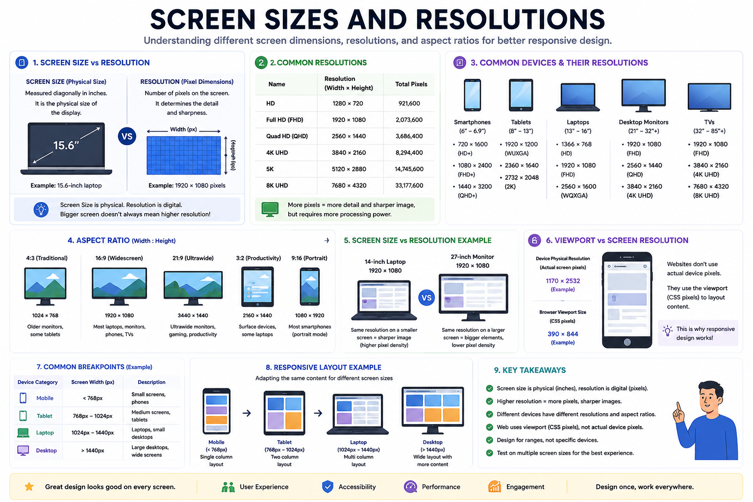
# What Is Screen Size?
# What Is Resolution?
# What Are Pixels?
# Screen Size and Resolution Are Different
# Common Device Resolutions
# Aspect Ratio
# Why Higher Resolution Isn't Always Better
# Responsive Design and Screen Sizes
# Viewport Size vs Screen Resolution
# Common Breakpoints
# Best Practices
# Common Misconceptions
# Description:
Modern applications are accessed on devices with vastly different screen sizes and resolutions. From smartwatches and smartphones to desktops and televisions, displays vary in physical dimensions and pixel density. Understanding screen sizes and resolutions helps developers create responsive, accessible, and visually consistent experiences across devices.
# What Is Screen Size?
Screen size refers to the physical dimensions of a display, typically measured diagonally in inches.
Examples:
- Smartwatch: 1.5"
- Smartphone: 6.7"
- Tablet: 11"
- Laptop: 14"
- Desktop Monitor: 27"
- Television: 55"
Screen size describes the physical display, not how many pixels it contains.
# What Is Resolution?
Resolution represents the number of pixels displayed on a screen.
It is usually expressed as: Width × Height
Examples:
| Resolution | Width × Height |
|---|---|
| HD | 1280 × 720 |
| Full HD | 1920 × 1080 |
| Quad HD (QHD) | 2560 × 1440 |
| 4K UHD | 3840 × 2160 |
| 8K UHD | 7680 × 4320 |
Higher resolutions generally provide sharper images because more pixels are available.
# What Are Pixels?
Pixels are the tiny dots that make up images and text on a screen.
For example: 1920 × 1080 = 2,073,600 pixels
Each pixel contributes to the final image displayed.
Millions of pixels work together to render graphics, text, and videos.
# Screen Size and Resolution Are Different
These concepts are often confused.
Example
Device A:
- 14-inch laptop
- 1920 × 1080 resolution
Device B:
- 14-inch laptop
- 1920 × 1080 resolution
Although both have the same number of pixels, the 27-inch monitor spreads them over a larger area.
As a result:
- Images appear larger.
- Pixel density becomes lower.
# Common Device Resolutions
Smartphones
Typical resolutions:
- 720 × 1600
- 1080 × 2400
- 1440 × 3200
Characteristics:
- High pixel density
- Portrait orientation
Tablets
Common resolutions:
- 1920 × 1200
- 2360 × 1640
- 2732 × 2048
Characteristics:
- Larger content area
- Landscape and portrait modes
Laptops
Common resolutions:
- 1366 × 768
- 1920 × 1080
- 2560 × 1600
Characteristics:
- Productivity-focused
- Keyboard and mouse input
Desktop Monitors
Typical resolutions:
- 1920 × 1080
- 2560 × 1440
- 3840 × 2160
Characteristics:
- Large workspaces
- Multiple windows
TVs
Typical resolutions:
- Full HD
- 4K UHD
- 8K UHD
Characteristics:
- Viewing from a distance
- Large screens
# Aspect Ratio
Aspect ratio describes the relationship between width and height.
16:9
Most modern laptops, monitors, and TVs.
Examples:
- 1920 × 1080
- 3840 × 2160
4:3
Older monitors and televisions.
21:9
Ultrawide monitors.
Examples:
- 3440 × 1440
Useful for multitasking and gaming.
# Why Higher Resolution Isn't Always Better
Higher resolutions offer:
- Sharper images
- More workspace
- Better visual quality
But they also require:
- More GPU power
- More battery consumption
- Larger files
- Greater processing resources
Design should focus on usability rather than simply maximizing resolution.
# Responsive Design and Screen Sizes
Applications should adapt to many screen sizes.
Smartphone
Single-column layout
Tablet
Two-column layout
Desktop
Multi-column layout
Responsive design allows content to adjust automatically without creating separate websites for each device.
# Viewport Size vs Screen Resolution
A device's screen resolution is not always the same as the browser viewport.
Phone Physical resolution: 1170 × 2532, Browser viewport: 390 × 844
Modern browsers use CSS pixels rather than physical pixels.
This is why responsive design relies on viewport size instead of actual screen resolution.
# Common Breakpoints
Developers often design for ranges instead of specific devices.
| Device Category | Approximate Width |
|---|---|
| Mobile | < 768px |
| Tablet | 768px – 1024px |
| Laptop | 1024px – 1440px |
| Desktop | > 1440px |
These values vary depending on the application.
# Best Practices
Avoid Designing for Specific Devices
New devices appear constantly.
Design for ranges rather than models.
Use Flexible Layouts
Responsive designs adapt better than fixed layouts.
Test Multiple Screen Sizes
Applications should work across:
- Phones
- Tablets
- Laptops
- Desktops
- TVs
Focus on Content
Prioritize readability and usability over pixel perfection.
# Common Misconceptions
Bigger Screen Means Higher Resolution
Not necessarily.
A large screen can have the same resolution as a smaller one.
More Pixels Always Mean Better Experience
User experience depends on:
- Layout
- Typography
- Accessibility
- Performance
not only resolution.
Every Device Needs a Separate Design
Responsive design allows a single application to adapt across devices.
Article Metadata:
Published Date: 2026-06-27
Updated Date: 2026-06-27
About the Author: Team absequ is a group of engineers and researchers working on real-world systems, software development, and technology solutions.