
Pixels
# Index
# Description
# What Are Pixels?
# Physical Pixels
# CSS Pixels
# Why Do We Need CSS Pixels?
# What Is Device Pixel Ratio (DPR)?
# Relationship Between Screen Resolution and Viewport
# Retina Displays
# Why Images Sometimes Look Blurry
# Responsive Images
# Checking Device Pixel Ratio
# Common Device Pixel Ratios
# Why Developers Rarely Think About Physical Pixels
# Common Misconceptions
# Description:
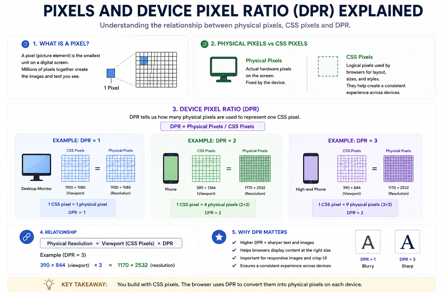
Modern displays contain millions of tiny dots called pixels that work together to render text, images, videos, and user interfaces. However, the pixels developers work with in CSS are not always the same as the physical pixels present on a device. Device Pixel Ratio (DPR) bridges this gap by defining how many physical pixels correspond to a single CSS pixel. Understanding pixels and DPR is essential for building responsive websites, creating sharp images, and understanding why viewport sizes differ from screen resolutions.
# What Are Pixels?
A pixel (short for picture element) is the smallest addressable unit on a display.
Millions of pixels combine to form everything visible on a screen.
For example: 1920 × 1080
contains: 2,073,600 pixels
Each pixel contributes color information that creates images and text.
# Physical Pixels
Physical pixels are the actual hardware pixels present on a display.
For example:
| Device | Physical Resolution |
|---|---|
| Laptop | 1920 × 1080 |
| Monitor | 3840 × 2160 |
| Smartphone | 1170 × 2532 |
These pixels are fixed by the hardware.
# CSS Pixels
Browsers do not expose physical pixels directly to web developers.
Instead, browsers use CSS pixels.
CSS pixels are logical units used for:
- Width
- Height
- Fonts
- Margins
- Layouts
Example: button { width: 100px; }
The browser determines how many physical pixels are needed to display those 100 CSS pixels.
# Why Do We Need CSS Pixels?
Suppose a phone has: 1170 × 2532 physical pixels
If browsers used physical pixels directly:
- Text would appear tiny.
- Buttons would be difficult to tap.
- Websites would become unusable.
CSS pixels provide a consistent sizing system across devices.
# What Is Device Pixel Ratio (DPR)?
Device Pixel Ratio (DPR) describes how many physical pixels are used to represent one CSS pixel.
Formula: DPR = Physical Pixels / CSS Pixels
# Example: DPR = 1
Desktop Monitor
Physical Resolution: 1920 × 1080
Viewport: 1920 × 1080
Device Pixel Ratio: 1
One CSS pixel equals one physical pixel.
# Example: DPR = 2
Phone
Physical Resolution: 1170 × 2532
Viewport: 585 × 1266
Device Pixel Ratio: 2
Each CSS pixel uses: 2 × 2 = 4 physical pixels
This creates sharper text and images.
# Example: DPR = 3
Physical Resolution: 1170 × 2532
Viewport: 390 × 844
Device Pixel Ratio: 3
Each CSS pixel uses: 390 × 3 = 1170, 844 × 3 = 2532
Each CSS pixel maps to: 3 × 3 = 9 physical pixels
This is why modern phones look extremely sharp.
# Relationship Between Screen Resolution and Viewport
Phone:
Physical Resolution: 1170 × 2532
Viewport: 390 × 844
Device Pixel Ratio: 3
Relationship: Viewport × DPR = Physical Resolution
This explains why viewport dimensions are smaller than actual screen resolutions.
# Retina Displays
Apple popularized the term Retina Display.
A Retina display uses a high device pixel ratio so that individual pixels become difficult for the human eye to distinguish.
Examples:
| DPR | Common Devices |
|---|---|
| 1 | Older Monitors |
| 2 | Many Laptops |
| 3 | Smartphones |
| 4 | Some Premium Devices |
Higher DPR results in:
- Sharper text
- Better image quality
- Improved readability
# Why Images Sometimes Look Blurry
Suppose an image is: 100 × 100 pixels and displayed on a device with: DPR = 3
The browser must stretch the image across: 300 × 300 physical pixels which may cause blurriness.
Higher-resolution images solve this problem.
# Responsive Images
Modern websites often provide multiple image sizes.
Example:
<img src="small.jpg" srcset=" small.jpg 1x, medium.jpg 2x, large.jpg 3x" >
The browser automatically selects the appropriate image based on the device's DPR.
This improves image quality while reducing bandwidth usage.
# Checking Device Pixel Ratio
JavaScript provides: window.devicePixelRatio
Example: console.log(window.devicePixelRatio);
Possible outputs:
- 1
- 2
- 3
- 4
# Common Device Pixel Ratios
| DPR | Typical Devices |
|---|---|
| 1 | Older Monitors |
| 1.25 | Windows Scaling |
| 1.5 | Some Tablets |
| 2 | Retina Laptops |
| 3 | Smartphones |
| 4 | Premium Phones |
# Why Developers Rarely Think About Physical Pixels
Modern browsers handle most pixel-density concerns automatically.
Developers generally work with:
- CSS pixels
- Viewports
- Relative units
- Responsive layouts
The browser converts these into physical pixels behind the scenes.
# Common Misconceptions
More Pixels Mean Larger Content
False
Higher pixel density increases sharpness, not size.
Screen Resolution Equals Viewport
False
Viewport size depends on CSS pixels and DPR.
All Devices Have DPR = 1
Modern phones and laptops frequently use DPR values of 2 or 3.
Article Metadata:
Published Date: 2026-07-12
Updated Date: 2026-07-12
About the Author: Team absequ is a group of engineers and researchers working on real-world systems, software development, and technology solutions.