
Mobile-First Design
# Index
# Description
# What Is Mobile-First Design?
# Why Mobile-First?
# Desktop-First vs Mobile-First
# Core Principle: Progressive Enhancement
# Mobile-First CSS
# Mobile-First Media Queries
# Benefits of Mobile-First Design
# Mobile-First with Flexbox
# Mobile-First with CSS Grid
# Content Priority
# Common Mistakes
# Mobile-First Beyond Phones
# Mobile-First and SEO
# Description:
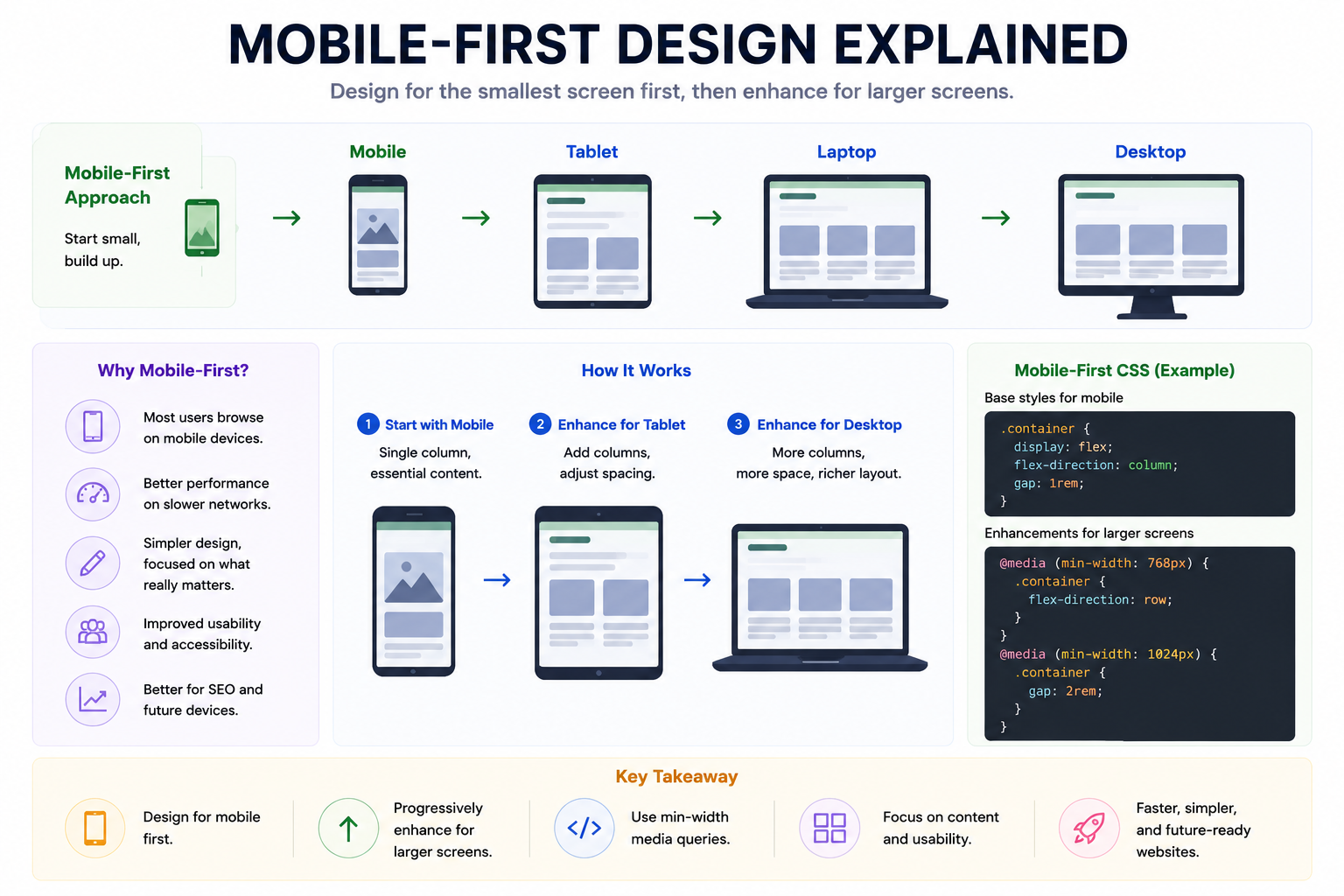
Mobile-first design is an approach to web development where applications are designed and built for smaller screens first, then progressively enhanced for larger devices such as tablets, laptops, and desktops. Rather than creating a desktop layout and shrinking it down, mobile-first design starts with essential content and functionality and gradually adds complexity as more screen space becomes available. Today, mobile-first design has become one of the fundamental principles of responsive web development.
# What Is Mobile-First Design?
Mobile-first means: Mobile > Tablet > Laptop > Desktop
Instead of: Desktop > Tablet > Mobile
Developers begin with the smallest screen and progressively enhance the experience for larger screens.
# Why Mobile-First?
Most internet traffic today comes from smartphones.
Users access websites using:
- Smartphones
- Tablets
- Laptops
- Desktops
- Foldable devices
Designing for mobile first helps ensure that applications remain usable across all devices.
# Desktop-First vs Mobile-First
Desktop-First
Start with: Desktop Layout
Then remove features for smaller screens.
Problems:
- Large CSS files
- Complex media queries
- Performance issues
- Difficult maintenance
Mobile-First
Start with: Small Screen
Then add enhancements.
Benefits:
- Simpler layouts
- Better performance
- Easier maintenance
- Improved accessibility
- Progressive enhancement
# Core Principle: Progressive Enhancement
Mobile-first design follows progressive enhancement.
Start with:
- Essential content
- Core functionality
Then add:
- Larger layouts
- Additional spacing
- Multiple columns
- Rich interactions
As screen size increases.
# Mobile-First CSS
Base styles target mobile devices.
Example: .container { display: flex; flex-direction: column; }
For larger screens: @media (min-width: 768px) { .container { flex-direction: row; } }
Notice: min-width is used instead of: max-width
This is characteristic of mobile-first design.
# Mobile-First Media Queries
Base: .card { width: 100%; }
Tablet: @media (min-width: 768px) { .card { width: 50%; } }
Desktop: @media (min-width: 1024px) { .card { width: 33.33%; } }
Layouts become richer as space increases.
# Benefits of Mobile-First Design
Better Performance
Smaller devices often have:
- Slower networks
- Less memory
- Less processing power
Mobile-first encourages lightweight experiences.
Simpler Interfaces
Limited space forces developers to prioritize important content.
This often leads to cleaner designs.
Easier Maintenance
Styles naturally build upon one another.
Media queries remain easier to understand.
Improved Accessibility
Simple layouts:
- Improve readability
- Reduce cognitive load
- Enhance navigation
Future-Proof Design
New devices appear constantly.
Mobile-first focuses on content and adaptability instead of specific devices.
# Mobile-First with Flexbox
Mobile:
- display: flex;
- flex-direction: column;
Desktop:
- @media (min-width: 1024px) { flex-direction: row; }
Flexbox naturally complements mobile-first development.
# Mobile-First with CSS Grid
Mobile: grid-template-columns: 1fr;
Tablet: grid-template-columns: repeat(2,1fr);
Desktop: grid-template-columns: repeat(3,1fr);
Grid layouts progressively expand with available space.
# Content Priority
Mobile-first forces developers to ask:
- What is most important?
- What should users see first?
- Which features are essential?
This improves overall user experience.
# Common Mistakes
Hiding Desktop Designs
Mobile-first does not mean: Create desktop → Hide everything on mobile.
Instead: Build mobile → Enhance for desktop.
Ignoring Tablets
Responsive designs should adapt smoothly across all screen sizes.
Too Many Breakpoints
Modern CSS features like:
- Flexbox
- Grid
- clamp()
Forgetting Touch Targets
Buttons should be large enough for fingers.
Small clickable areas frustrate users.
# Mobile-First Beyond Phones
Mobile-first principles benefit:
- Tablets
- Foldables
- Smart TVs
- Automotive displays
- Smartwatches
By focusing on simplicity and progressive enhancement, applications become more adaptable.
# Mobile-First and SEO
Search engines prioritize mobile usability.
Mobile-friendly websites often benefit from:
- Better rankings
- Improved accessibility
- Faster loading times
- Better user engagement
Article Metadata:
Published Date: 2026-07-15
Updated Date: 2026-07-15
About the Author: Team absequ is a group of engineers and researchers working on real-world systems, software development, and technology solutions.